Museum changes its logo |
← |
Published: 2024-01-08
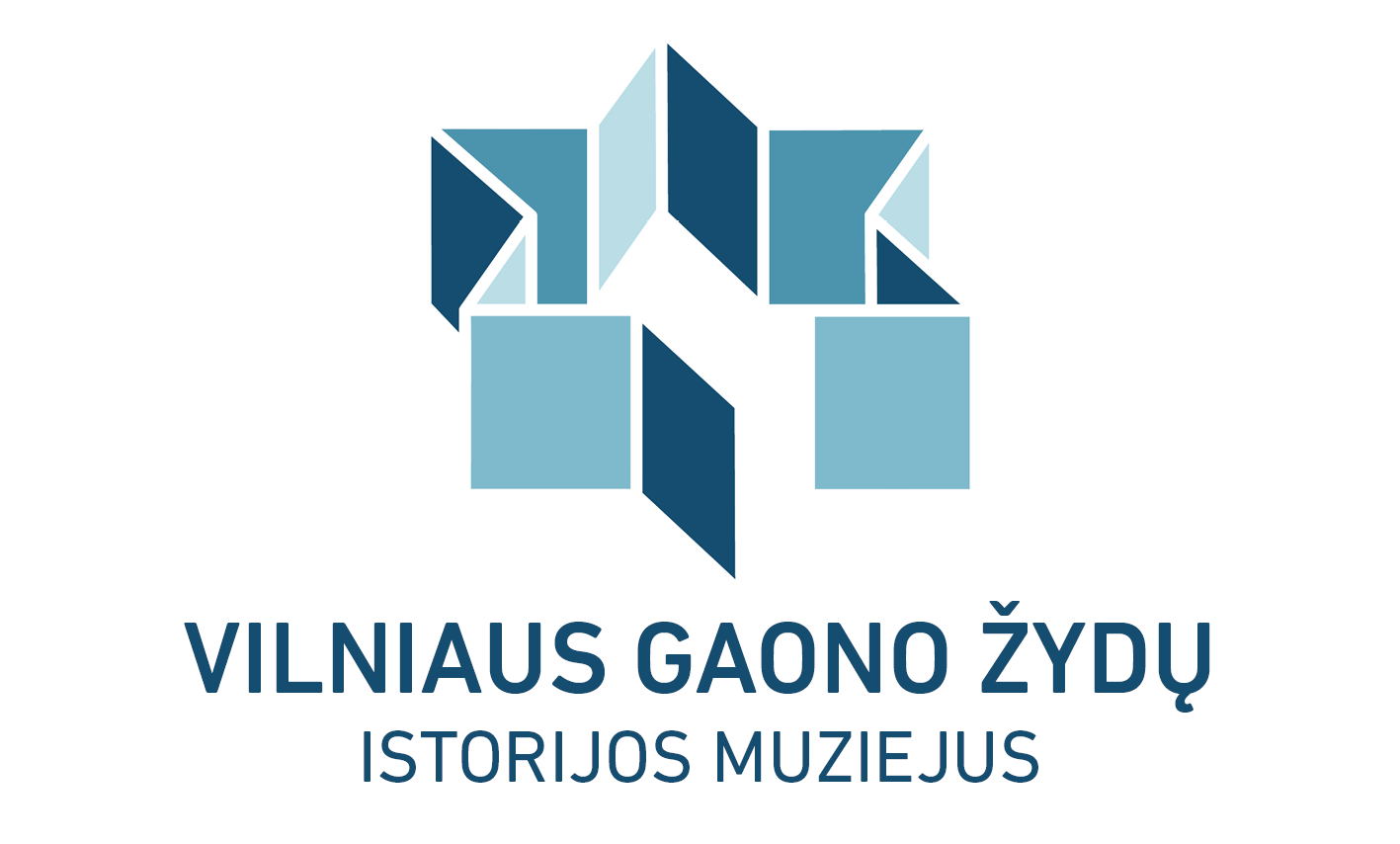
The Vilna Gaon Museum of Jewish History has decided to change its identifying mark - its logo. The task of designing the new symbol was entrusted to independent designer, visual identity consultant and author Daniela Bak, the daughter of Samuel Bak, an honorary citizen of Vilnius.
Daniela Bak on new logo:
"When I was asked to design the logo for the Vilna Gaon Museum - which includes the Samuel Bak Museum - I looked for inspiration in the paintings of Samuel Bak. I therefore used symbols, metaphors and visual illusions that are the essence of his art.

The new logo of the Vilna Gaon Museum of Jewish History represents an architectural volume in the shape of the Star of David. It symbolises the museum’s home - a physical “container” - dedicated to expose the Jewish culture of Vilnius, its history and identity.
The structure is open and inviting. The angled walls reflect the light in a variety of shades, inside and out, representing a multitude of perspectives and aspects of the museums’ purpose. The star-shaped-building is seen from above, a point of view and a distance that allows an exploration in space and time, while an open door draws us in, leading us to a more intimate discovery.

Daniela Bak
The ”open door” is, in reality, a missing wall. While being invisible, we can imagine it, and complete the star shape in our minds. This incomplete structure can also bee seen as a metaphor of the missing part of the Jewish community, shattered by the holocaust.
Upon close observation, we realise that the symbol of the Star of David is only an optical illusion, suggested by the white space left between the geometrical shapes.
.-Kunst-archive.net-nuotr..jpg)
The Ghetto (The Ghetto of Jewish History)
The symbol looks like it exists in an imaginary space. The geometrical shapes don’t touch one another, and the white spaces between them add to the lightness of a surreal floating monument.
The Star of David symbol is therefore “hidden”- only imagined - just like it was in the precedent logo of the museum, where it was suggested by the grid of the geometrical black and white shapes. This ”optical game”, as well as the use of separate geometrical shapes, establishes an interesting continuation between the old logo and the new one.
The new logo design was inspired by Samuel Bak’s themes, his metaphors and the witty spirit of his storytelling. For the logo, I was particularly inspired by a series of paintings representing structures in the shape of the Star of David."

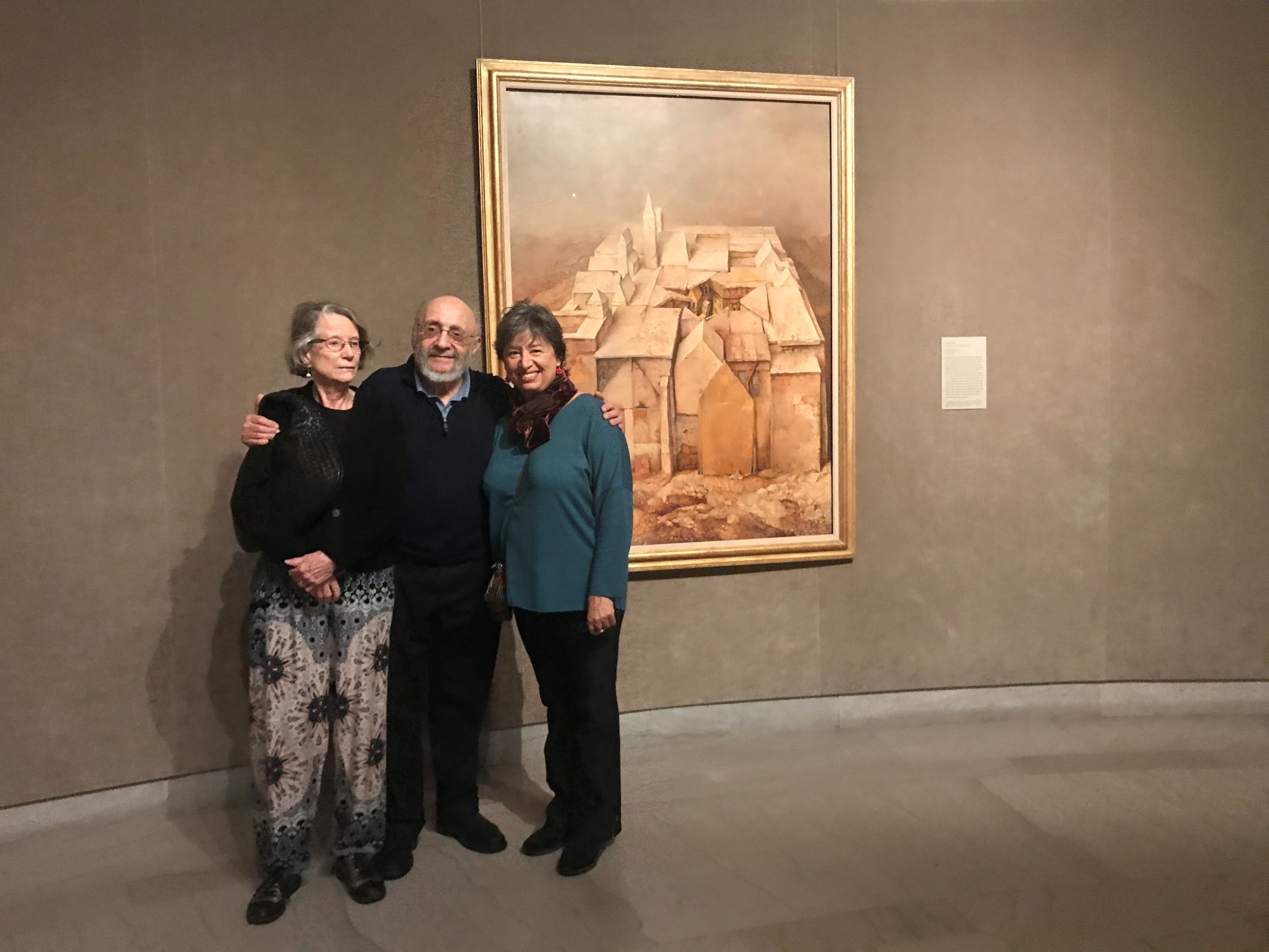
Samuel Bak with his wife Josee and daughter Daniela.
| ↑ | ← |
